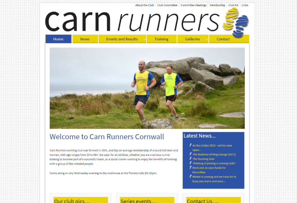
I was approached by the club to redesign their website, which was a little out of date to say the least. The brief was for a site that was modern and contemporary, that was very picture heavy and had an events calendar and a news section.
Carn Runners

Logo
As part of the redesign for Carn runners I was asked to create a new logo for use on the site and on printed club mechanise. The logo needed to be of a minimal design with a lot of block colour, be able to be read at a distance and the show what the club was all about.
